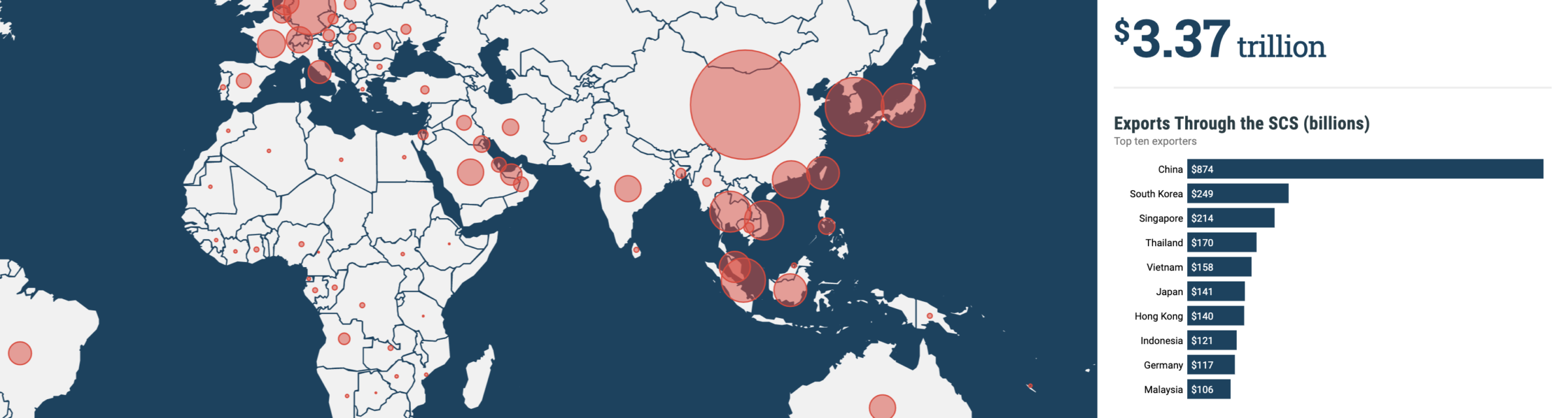
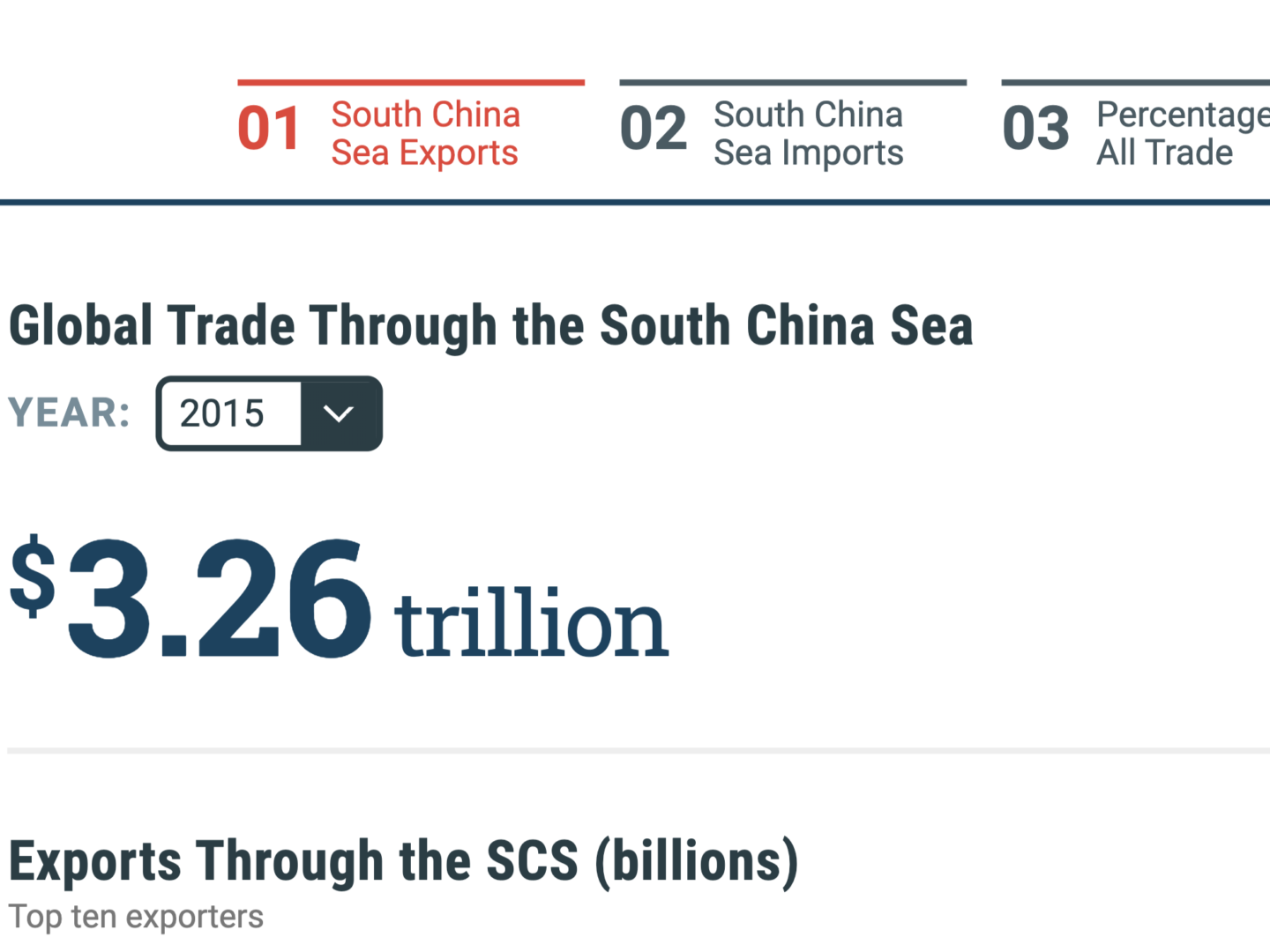
THIS PROJECT is a three-part interactive visualization we made for the Center for Strategic and International Studies. We created a custom interactive map that allows you to navigate a unique dataset of all the global trade that passes through the South China Sea using the map interface and accompanying interactive graphs. We used the mapping interface to create a three-part story that allows the user to both instantly see top-line trends and explore subtle patterns within the data. The visualization displays the percentage of each country’s trade passing through the South China Sea, including several ways to slice the numbers and the ability to view snapshots from previous years.
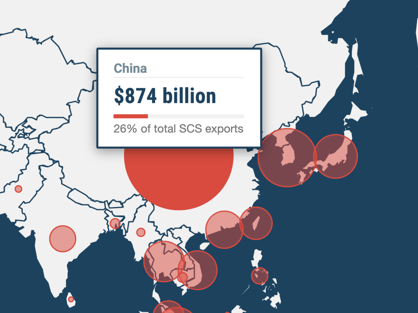
THE MAP EXPLORES how South China Sea shipping routes influence Asian and global economies. Roughly 80 percent of global trade is transported by sea and an estimated 60 percent of all maritime trade passes through Asia, with the South China Sea carrying an estimated one-third of global shipping. CSIS wanted to produce a data visualization that illustrated the massive trade volume passing through these contentious waters, much of which is disputed by China and several other neighboring countries.
We built the interactive map using a unique combination of the powerful D3 library and the open-source Leaflet mapping library. We coded a custom-built visualization that connects these two libraries, opening a pathway of communication between both APIs. Using this technique, we were able to achieve a highly interactive experience, providing data and feedback from the map and charting elements simultaneously.
We were able to achieve a highly interactive experience, providing data and feedback from the map and charts simultaneously